• STUDIO
    • about ›
    • awards ›
    • publications ›
    • faq ›
    • clients ›
    • paolo ›
    • creative cloud ›
    • contact ›
  • WORK
    • EXHIBITION DESIGN/ The KSFX Experience
    • EXHIBITION DESIGN/
    • INTERIOR + ARCHITECTURE/ Revision
    • INTERIORS + ARCHITECTURE/
    • URBAN IDENTITY/ The Irrational City 2.0
    • URBAN IDENTITY/
    • VISUAL DESIGN/ Gentle Signs
    • VISUAL DESIGN/
    • MASS RETAIL/ Ipercoop | Identity books
    • MASS RETAIL/
    • EXHIBITION DESIGN/ Mediterranean Modern
    • INTERIOR + ARCHITECTURE/ From Soil to Grape
    • EXHIBITION DESIGN/ A New Smart Future
    • EXHIBITION DESIGN/ Urban Dairy
    • EXHIBITION DESIGN/ Bespoke Romance
    • EXHIBITION DESIGN/ Wonderland
    • INTERIORS + ARCHITECTURE/ Ithaca
    • INTERIORS + ARCHITECTURE/ Hi-line
    • EXHIBITION DESIGN/ A Switch of Mind
    • EXHIBITION DESIGN/ Casa Hotel
    • EXHIBITION DESIGN/ Split in Two
    • EXHIBITION DESIGN/ Framing
    • INTERIORS + ARCHITECTURE/ (S)Squares
    • EXHIBITION DESIGN/ Monochrome
    • EXHIBITION DESIGN/ East meets west
    • URBAN IDENTITY/ Growing by Numbers
    • INTERIORS + ARCHITECTURE/ How is the Future?
    • INTERIORS + ARCHITECTURE/ DDM_Jewelry Atelier+Shop
    • VISUAL DESIGN/ Bond and Embrace
    • INTERIOR + ARCHITECTURE/ Transit
    • EXHIBITION DESIGN/ A Temporary Showroom
    • URBAN IDENTITY/ Untitled_with Maurizio Nannucci
    • EXHIBITION DESIGN/ The Lobby
    • URBAN IDENTITY/ Growing by Numbers_Variable Blurring Mix
    • URBAN IDENTITY/ The Irrational City
    • EXHIBITION DESIGN/ Inside-Outside_The Stage
  • CONTACT
pc-|<

pc-|<

  • STUDIO
    • about ›
    • awards ›
    • publications ›
    • faq ›
    • clients ›
    • paolo ›
    • creative cloud ›
    • contact ›
  • WORK
    • EXHIBITION DESIGN/ The KSFX Experience
    • EXHIBITION DESIGN/
    • INTERIOR + ARCHITECTURE/ Revision
    • INTERIORS + ARCHITECTURE/
    • URBAN IDENTITY/ The Irrational City 2.0
    • URBAN IDENTITY/
    • VISUAL DESIGN/ Gentle Signs
    • VISUAL DESIGN/
    • MASS RETAIL/ Ipercoop | Identity books
    • MASS RETAIL/
    • EXHIBITION DESIGN/ Mediterranean Modern
    • INTERIOR + ARCHITECTURE/ From Soil to Grape
    • EXHIBITION DESIGN/ A New Smart Future
    • EXHIBITION DESIGN/ Urban Dairy
    • EXHIBITION DESIGN/ Bespoke Romance
    • EXHIBITION DESIGN/ Wonderland
    • INTERIORS + ARCHITECTURE/ Ithaca
    • INTERIORS + ARCHITECTURE/ Hi-line
    • EXHIBITION DESIGN/ A Switch of Mind
    • EXHIBITION DESIGN/ Casa Hotel
    • EXHIBITION DESIGN/ Split in Two
    • EXHIBITION DESIGN/ Framing
    • INTERIORS + ARCHITECTURE/ (S)Squares
    • EXHIBITION DESIGN/ Monochrome
    • EXHIBITION DESIGN/ East meets west
    • URBAN IDENTITY/ Growing by Numbers
    • INTERIORS + ARCHITECTURE/ How is the Future?
    • INTERIORS + ARCHITECTURE/ DDM_Jewelry Atelier+Shop
    • VISUAL DESIGN/ Bond and Embrace
    • INTERIOR + ARCHITECTURE/ Transit
    • EXHIBITION DESIGN/ A Temporary Showroom
    • URBAN IDENTITY/ Untitled_with Maurizio Nannucci
    • EXHIBITION DESIGN/ The Lobby
    • URBAN IDENTITY/ Growing by Numbers_Variable Blurring Mix
    • URBAN IDENTITY/ The Irrational City
    • EXHIBITION DESIGN/ Inside-Outside_The Stage
  • CONTACT
04_IperCoop-Retail-COPERTINA-0_w.jpg

MASS RETAIL

< | >

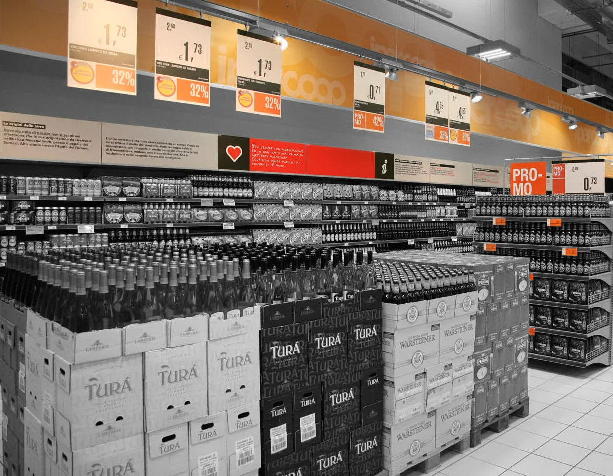
  • When we met the client – the most prominent mass retailing brand in Italy – he was starting to reorganize the commercial format of its hypermarket chain. At the same time it was evident the need to adjust its identity to a new philosophy implying simplification / reduction / systematization of information. The situation was chaotic, characterized by the inconsistent and free application of an old communication format in each of the outlets.

    So – inspired by functional urban aesthetic and in need for delivering clear and consistent messages – the project provides a spatial mesh organized in fixed areas and levels designed for communicating. This amplifies the understanding from the customers of the rich body of information and simplifies the updates made by the store staff. The ethic of saving, underlying the cooperative philosophy, is here transposed using the minimum amount of signs, operating a continuous formal subtraction. A chromatic identification between the brand and the concept of “affordability” is a further element of characterization of the intervention, which strengthen the brand perception and defines the image of the stores.

    –

    Client/

    Coop Italia
    In-Store Identity 
for 80 Hypermarkets


Concept/

    Paolo Cesaretti+Cristiana Vannini With Nicola Seta
 Qart Progetti | Donatella Caruso, Matteo Fioravanti, Franco Pisani

    Design Team/
    
Paolo Cesaretti+Cristiana Vannini With Alessandro Ruga, Merve Bindebir, Federico Boriani, Beppe Del Greco, Rowan Parkinson Dinning, Claudia Gresta
Qart Progetti | Donatella Caruso, Matteo Fioravanti, Franco Pisani

    Visual Design/

    Claudia Astarita, Massimo Canali, Clara Pozzetti

    
Area/

    7.000-18.00 Sqm

Featured
IperCoop-Retail-1.jpg
IperCoop-Retail-2.jpg
IperCoop-Retail-3.jpg
IperCoop-Retail-6.jpg
IperCoop-Retail-4.jpg
IperCoop-Retail-5.jpg

|| IVA IT 04752260481

paolo cesaretti | interiors and architecture | exhibition design | firenze | milano ||