-
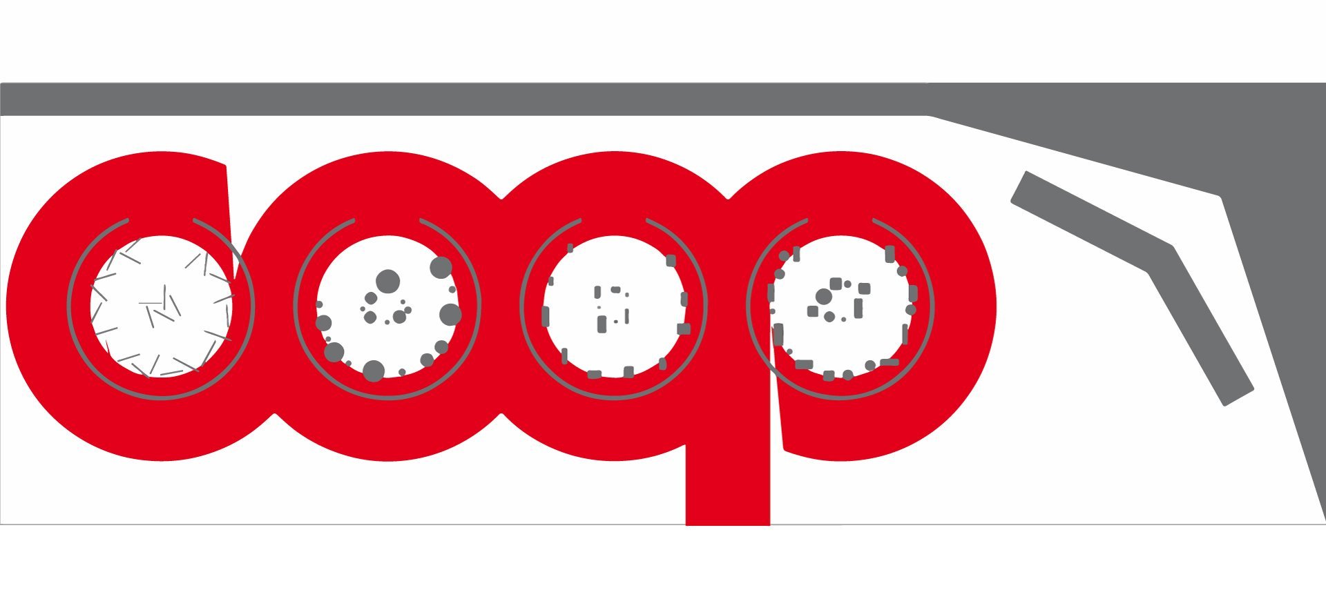
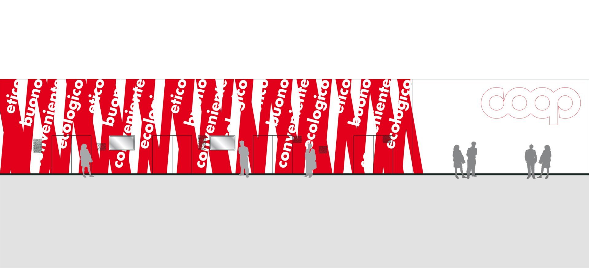
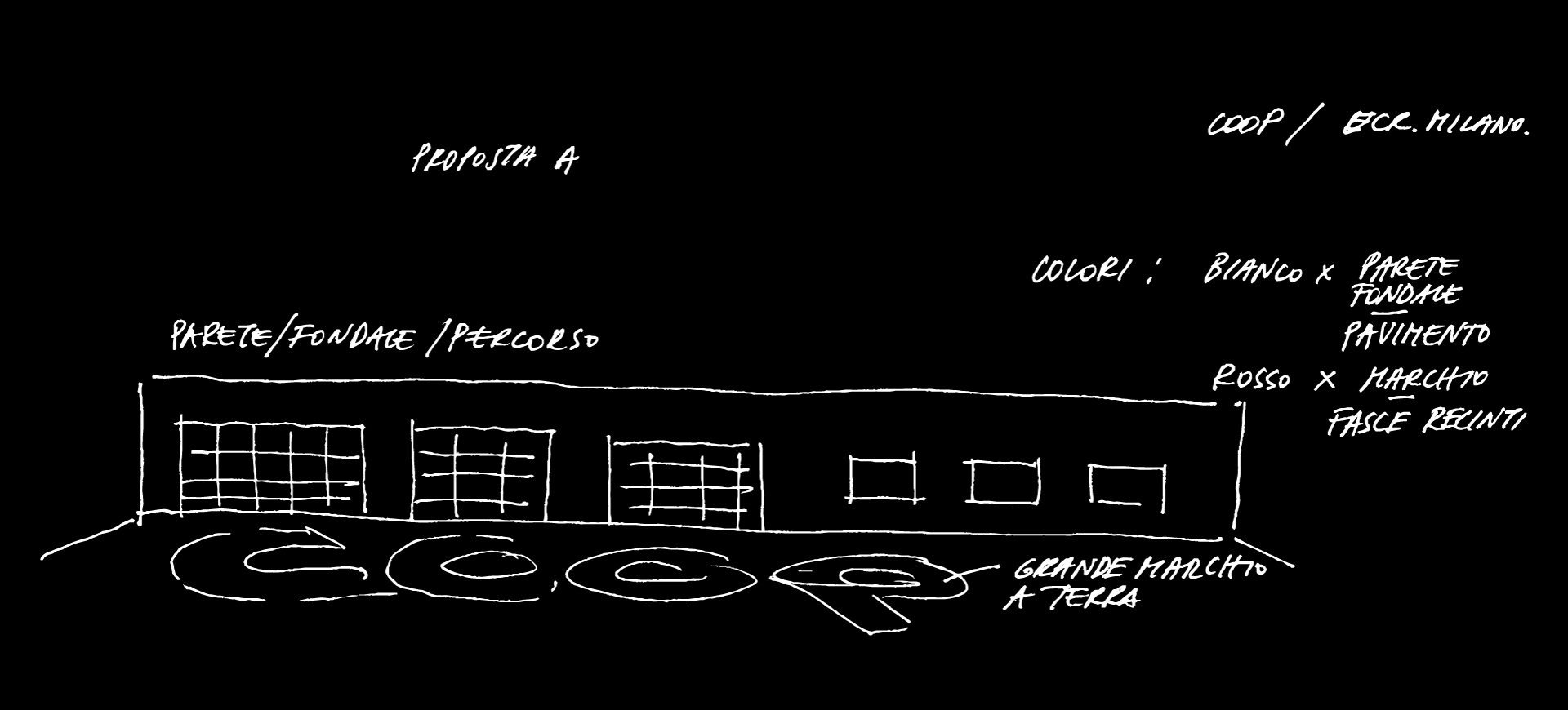
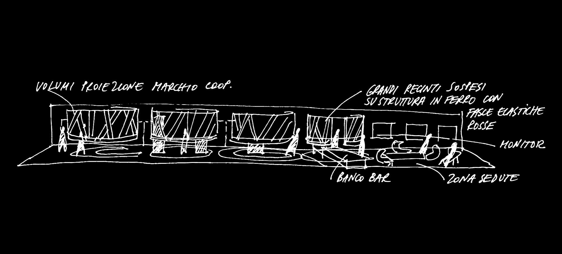
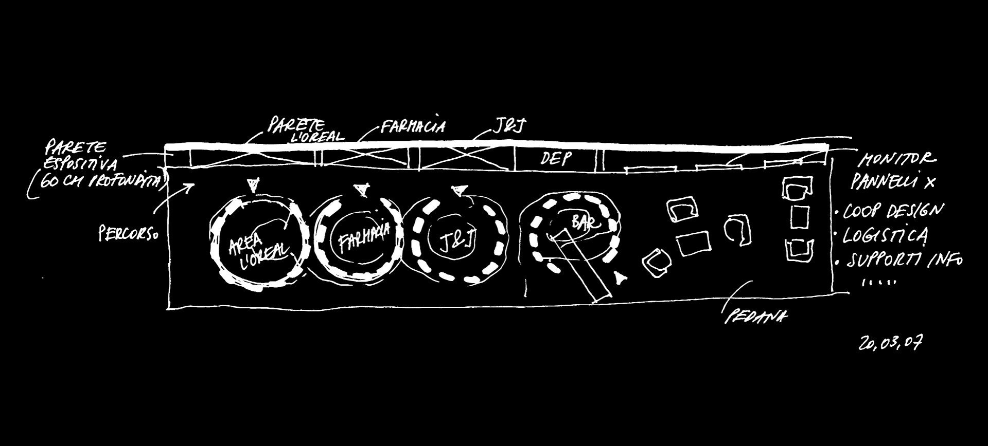
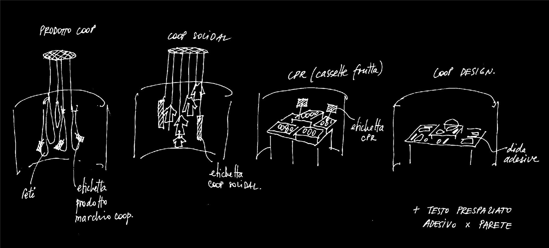
On occasion of its participation to the yearly appointment ECR Efficient Consumer Response forum, Coop choose to present concrete actions in a few specific domains such as environmental protection, defense of human rights and nutritional safety. Reminding the visitor of the company’s value-focused approach, Coop’s distinctive logo and corporate red and white colors are defining elements shifting in the stand design as two recurrent metaphors, namely bond and embrace. The logo is painted in giant red letters right across the white floor space. The circular outline of each letter doubled as the suspended encircling perimeter of four small display areas dedicated to “fair trade” products and innovative research in sustainable processes. The large bottom wall evokes and magnifies the theme of bonding values and relations. A crowded reception and sampling area completes the space layout.
–
ADI Design Index_selected
–
Client/
Coop Italia
Trade show/
Ecr Europe Forum & Marketplace Milano It
Design/
Vc A / Paolo Cesaretti+Cristiana Vannini, Milano
Design team/
Vito Ruscio, Silvia Ferrario
Visual design/
Claudia Astarita
Contractor/
Way
Area/
300 Sqm
Photo/
Saverio Lombardi Vallauri